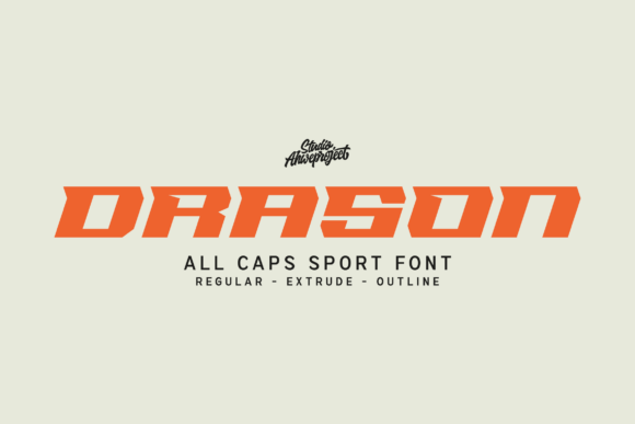
Drason: A Bold Display Font for Impactful Web Design
As a UI designer who ships dozens of landing pages, SaaS dashboards, and e-commerce experiences each year, I reach for display fonts like Drason when clarity, confidence, and visual authority matter most. It’s not just another all-caps typeface—it’s a deliberate tool for shaping how users perceive a brand before they read a single word.
Drason delivers sharp angles, tightly spaced aggressive shapes, and a high-contrast athletic rhythm that reads instantly—even at smaller sizes on mobile. Its geometry is modern but grounded, avoiding the cold sterility of ultra-minimalist fonts or the dated flash of 90s sports logotypes. That balance makes it unusually versatile across digital contexts where tone and legibility must coexist.
Where Drason Earns Its Place in Your Layout
Drason thrives in high-impact zones: hero section headlines, product name tags, CTA buttons with under 5 words, shop banners, course title cards, and portfolio project headers. It’s not built for paragraphs—but it excels where hierarchy needs reinforcement. On a coaching website, “UNLOCK YOUR POTENTIAL” in Drason over a muted background immediately signals ambition and action. In an online boutique, pairing it with a clean sans serif body font creates contrast that guides the eye straight to value propositions and limited-time offers.
For digital ads and social media graphics—especially static banners or thumbnail text overlays—Drason holds up remarkably well against busy imagery. Its tight letterfit and strong stroke contrast prevent visual bleed, even when layered over gradients or photos. On dark mode interfaces, it gains extra presence without requiring outline effects or excessive tracking adjustments.
Readability & Responsiveness: Practical Notes
Drason performs best at 24px and above on desktop, and 20px+ on mobile viewports. Below that, its angular terminals and compact spacing begin to compromise scanability—so avoid using it for navigation labels, form inputs, or small footer links. For responsive layouts, always pair it with a web-optimized sans serif (like Inter, Manrope, or IBM Plex Sans) for body copy and supporting UI text. That pairing maintains rhythm while letting Drason anchor key messaging.
On light backgrounds, use Drason at 100% black or near-black (#1a1a1a) for optimal contrast. On dark backgrounds, opt for pure white or a crisp off-white (#f8f8f8) rather than light gray—its sharp edges need full contrast to retain definition. Avoid semi-transparent overlays unless you’re applying them uniformly and testing across iOS and Android rendering engines.
Font Pairing Done Right
Drason pairs naturally with humanist and geometric sans serifs—not decorative scripts or ornate serifs. Think of it as the “voice” and your body font as the “conversation.” A strong pairing might be Drason for section headers + Inter for paragraph text + a subtle weight variation (e.g., Inter SemiBold for subheads). For editorial or premium brand sites, consider a restrained serif like Literata or Crimson Pro for long-form blog content—just keep Drason reserved for titles, pull quotes, and branded callouts.
Avoid pairing Drason with other bold display fonts or condensed all-caps families. Its personality is assertive; stacking similar energies creates visual noise, not harmony. And never force it into logo lockups with complex icons or intricate illustrations—it works best when given breathing room and a clear visual container.
Licensing, Formats & Real-World Use
Drason ships as a webfont-ready package—including WOFF2, WOFF, and variable font options where supported. Most licenses cover self-hosted websites, client projects, SaaS platforms, and digital templates—as long as usage aligns with the tier purchased. Always verify multilingual support if your audience spans Latin, Cyrillic, or Greek scripts; Drason includes extended Latin characters but may not cover diacritics for Vietnamese or Turkish without checking the specimen.
If you're building reusable design systems or selling Figma kits, confirm whether your license permits redistribution or embedding in editable assets. For online stores built on Shopify or WooCommerce, ensure the font files are served via your own domain (not third-party CDNs) to comply with most commercial font EULAs.
When to Reach for Drason—And When Not To
Use Drason when you need to signal energy, precision, or competitive spirit: a fitness app launch page, a developer tool’s feature banner, a creative agency’s case study header, or a podcast’s episode title graphic. It also strengthens brand consistency across touchpoints—reusing the same Drason treatment in email headers, social bios, and app splash screens builds recognition faster than color alone.
Don’t use Drason for accessibility-critical elements like error messages, form validation, or legal disclaimers. Its stylistic compression reduces character distinction at small sizes, which can hinder screen reader–assisted scanning and cognitive load for neurodiverse users. Reserve it for expressive, intentional moments—not functional infrastructure.
In practice, I’ve seen Drason lift conversion rates on product landing pages by sharpening perceived value: a headline like “BUILT FOR SPEED” in Drason next to a sleek product mockup increases perceived quality more than generic bold sans serifs. It doesn’t manipulate—it clarifies. And in digital design, clarity is the first step toward trust.
Whether you're refining a brand kit, launching a new course, or optimizing a checkout flow, Drason serves as both a typographic anchor and a tone-setting device. It doesn’t shout to be heard—it commands attention by virtue of structure, proportion, and digital readiness. That’s rare in the display font category—and exactly why it belongs in your active font stack.